

A Cross-Check to Mann’s Hockey Stick
Sorry for being silent here for way too long. I guess I just took on a bad habit of starting articles and not finishing them. Partly this is because I like to go into depth before making a statement, partly it is because “climate science” is just a target rich environment. There are so many absurd stories worth to be told, which strangely enough were never covered. I can only emphasize again what a miserable job the “critical side” is doing. Anyway..
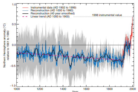
Michael Mann’s famous (or rather infamous) hockey stick has been talked about a lot. He was brave enough to “hide the decline” in tree ring proxy data, selected those data lines to fit the narrative and, abracadabra, disappeared the medieval warm period. And despite all this artistic brilliance, the IPCC took on the result as state of the art “consensus science”. No wonder this stirred up some controversy.
One important detail, and the mighty implications to it, was however disregarded. Mann’s “hockey stick” does not portray the global temperature, but just that of the NH. It gives us a wonderful opportunity to exploit and explode the whole thing. First we need to recall AR6’s table on total forcings.
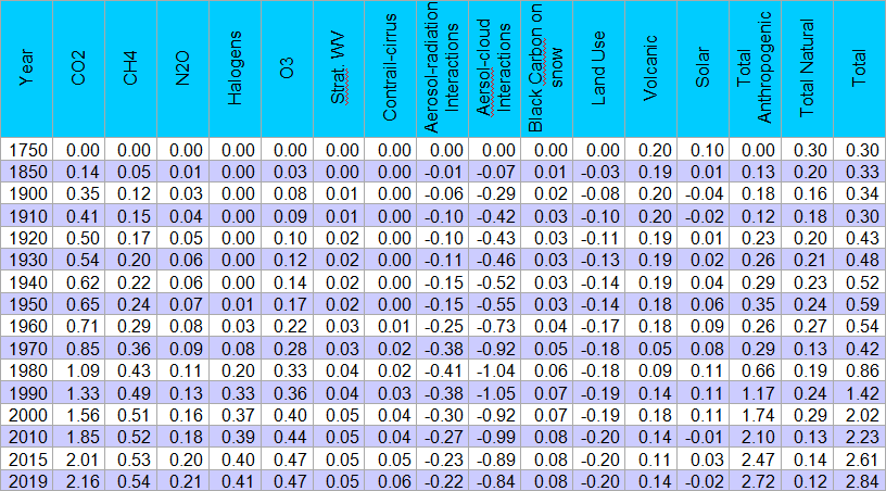
There are a couple of factors not being quite global. These are anthropogenic non-GHG forcings (let me call them ANGF) like aviation induced cirrus, aerosols, black carbon on snow and land use. Unlike GHGs they do not stay around in the atmosphere for years, having enough time to spread globally. Instead these anthropogenic forcings mainly stay where they are produced, so to say, and 90% of humans live in the northern hemisphere. That is something to bear in mind. But let me start with the aggregate picture of total forcings.
Of course things only go up since 1970 and that fits quite nicely the increasing temperatures since then. Notably the chart also points out two little dips, the one around 1970, in line with the decline from the 40s to the 70s, and even the tiny one around 1910, just like in the records1 (see below).
The problem is just that it is all a bit too sweet. The idea a forcing, or rather a dip in the forcing, of some 0.04W/m2, like around 1910, would have left a detectable signal in the otherwise pretty noisy temperature records, is just cheep. The IPCC data are rather of decorative than scientific quality, and that is not a compliment.
Equally the warming during first half of the 20th century will not work out. Temperatures then went up easily by 0.4K, as opposed to a forcing increment of no more than 0.3W/m2. If we project this relation onto the climate sensitivity for a doubling of CO2 with a 3.7W/m2 forcing, we would end up with a climate sensitivity of 5K (= 3.7 * 0.4 / 0.3). But that is not equilibrium climate sensitivity (ECS), but rather a pretty short term transient climate sensitivity (TCS), with ECS being yet much higher, possibly like 10K. There is just far too little forcing.
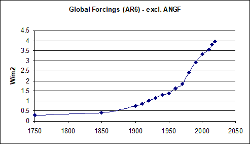
If we exclude ANGF we get the chart below. It is nothing exciting, just what climate scientists argue anyway. Although there are natural factors included, it is predominantly anthropogenic GHGs driving that forcing. And yes, according to it we have already attained a total GHG forcing equivalent or even exceeding that of a doubling of CO2 alone.
The real fun starts once we distiguish between northern and southern hemisphere and consider ANGF with an appropriate weighting. Allocating 90% of it to the NH and 10% to the SH is quite moderate, in reality it will be more one sided. As ANGF forcing is of course dominated by the negative aerosol component, a 10% weighting will just slightly dampen the total forcing within the SH.
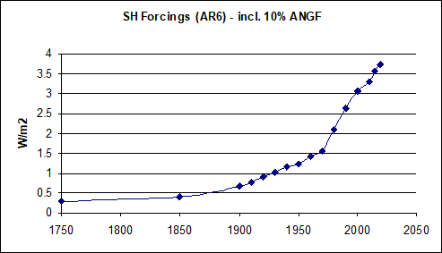
Notably the SH then not only has a much stronger total forcing as the NH (as below), but it also had plenty of time to start the warming process. We have anthropogenic GHGs in play, but basically no pollution to counter it. And so, despite the SH being oceanic and thus sluggish, it is kind of surprising we did not see more warming there.
Things turn out disastrous however once we look at the NH. Not just is the forcing less than half of the SH (48%) by 2019, but well into the 1970s it was definitely negative, based on the figures of the IPCC!!! I know, they do not make this point and rather avoid it like the devil avoids holy water. Nothing to see here, if no one talks about it, it will not be real. But of course it is very real.
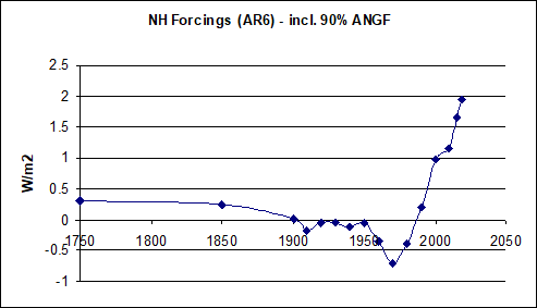
And even that is the “mild version”. As geometry goes, one third of the surface is located between 19.5°N and 19.5°S. It follows logically that anything north of 19.5°N is the northern third, so to say. Almost all of ANGF not just occurs in the NH, but beyond this latitude as well. This northern third, with most industrialized nations in it, should barely have warmed at all up to this day. Rather the GHG forcing there would only have sufficed to compensate for the aerosol induced cooling. Temperatures should have gone down from pre-industrial to the 1970s and recover to about their previous level thereafter. Also one might argue against the inclusion of black carbon on snow in ANGF, as some of it is apparently found in Antarctica. However since it is a positive forcing, it would only escalate the problem.
The one big issue, larger than all the others, Michael Mann’s “hockey stick”2 opened up, is to isolate the NH. For a moment forget about all the other known issues, like the medieval warm period, the denial of natural variability and so on. Mann beautifully portrays the warming trend over the first half of the 20th century, as it is understood and shown in so many other charts anyway. The problem is just, if “climate science” was even close to being right on anything, this should NEVER have happened in the NH. There should have been cooling, not warming until 1970! It is an issue you can easily disguise by only discussing global temperature, for which the IPCC forcing data have been carefully adapted.
Father forgive them, for they know not what they do
Mann contradicts the science. Even more so, “the science” contradicts “the science”. This is such an immediate problem, it renders all other problems obsolete. It was all meant to provide a smooth surface, where seemingly everything fits together with a lot of attention to even negligible details, like the 1910 dip (even visible in Mann’s chart). But if you just slightly change the perspective and look at it from a different side, it all falls apart.
Also the implications are disastrous. Why would the NH have warmed, when aerosols had to cool it? Had aerosols not yet learned to do their supposed job? Were they unaware of being located in the NH? Did warmth spill of over from the non-warming SH? You can not possibly fix this problem, unless you at least give up the cooling aerosols narrative. This “emergency exit” has always been left open, as direct aerosol forcing could be as high (in the sense of positive!) as 0.23W/m2 and aerosol cloud induced forcing only -0.06W/m2 according to AR6, given huge uncertainty margins.
Yet abandoning the large negative aerosol forcing, something necessary to explain NH warming up 1970, will only produce more problems on other sides. Then it will be even less possible to explain the pre 70s variations and you will need to concede natural causes, also then you can not make the case for mid to high climate sensitivity.
Summary
Mann’s “hockey stick” has been rightfully criticized for all the known reasons. But like so many times, it are the little, the subtle, or simply the logical things that weigh much heavier. The more immediate problem is the contradiction from within. The NH simply should not have warmed until the 1970s with the “consensus science” narrative of heating anthropogenic GHGs and cooling aerosols. If it did, like Mann’s “hockey stick” and other temperature records suggest, it falsifies the most basic claims of consensus science.
2IPCC TAR figure 2.20, page 134
Comments (0)
No comments found!