How to “hockey stick”
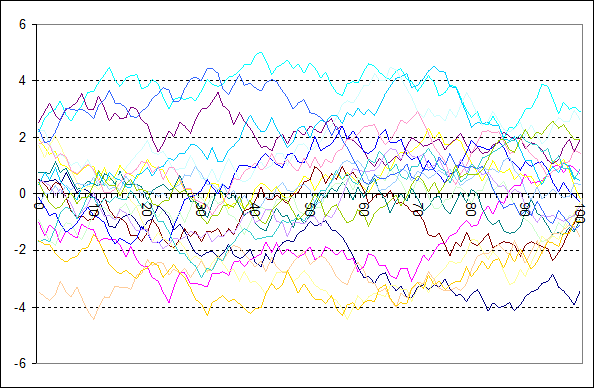
First of all you will need some really useless random data, and lots of them. I mean not that they were actual data, but just noise. They can easily be produced in Excel using the rand() function. I used the expression in D2 “=RAND()+C2-0.5-C2*0.01” and pulled that expression horizontally over 150 columns. What it does effectively is adding some random (-0.5 to +0.5) to every data point and containing the growth via the last term, subtracting one percent of the deviation from zero.
The whole procedure is meant to give some nice, noisy data garbage, like in the chart below. Btw. I truncated the first 50 entries because originally it all started with zero and I just wanted more diversity, so to say. The chart shows 20 of these random “data sets”, but I produced many more, namely 2000.

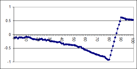
Among those 2000 pointless random data sets, I arbitrarily selected those 200 showing the strongest upward trend between data points 80 and 90 and calculated their average. The average for these data sets is shown in the graph below.

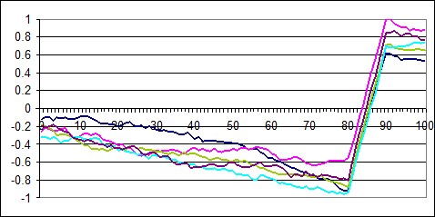
Of course I did not do that just one time, but many times over, just to see how the outcome would differ, and differ it did. It was a bit of a surprise because I thought 200 out of 2000 is pretty large sample, so the runs should barely be distinguishable. But as you can see I was wrong. Maybe it is because rand(), or any random function, does not really produce random figures. Then if like 300.000 “random” figures are generated almost at once, there might be some non-random noise. Anyway..

I think the basic pattern is yet well visible and consistent. We have the strict upward slope in the reference interval of 80-90. Otherwise, beyond the reference, we have a strict but moderate downward slope, and that is the interesting part. Why is that?
The thing is, any random walk will see reversals and opposed movements, especially so, if that random walk is somewhat restricted in the sense of not deviating too much from average. That is something certainly true for tree rings btw. Our selection demands strong growth within the reference interval and that simply increases the likelihood of declining trends beyond. This is all the mystery. The forced upward trend there induces the downward trend elsewhere.
So what has this nonsense to do with the “hockey stick”?
I think given the optical impression you might already have an idea, but there is more to tell. It is all about proxy data and the term proxy is already a bit over-ambitious. As the term suggests, tree ring data for instance are meant to represent something, like the climate. By calling them “proxies” the suggestion is it works, despite little evidence it actually does.
What is good for tree growth? Obviously it would be about good growing conditions. But what are good growing conditions? Well, that depends. Trees do not like it too cold, but neither too warm. Draughts are clearly unfavourable, but so are extremely wet conditions. Also trees need sunlight and if that takes a downturn, like after major volcanic eruptions, you can see it in the tree ring data. To name anthropogenic influences, they love CO2, but hate acid rain.
Then trees are living organisms, they will adept to the environment, as far as they can. For instance, if the climate should turn drier, they might drive their roots deeper into the soil for compensation. The impact of an unfavourable climate might thus diminish over time due to such adaptation. Honestly I have no clue what kind of coping mechanisms trees have and how they work, but given they are essential to life and ubiquitous, it would be pointless denying them. This too will mean a non-linearity between environmental conditions and tree ring data.
A lot of these tree ring data have been carefully collected. Unsurprisingly the data sets show quite diverse behaviour, depending on where they are from. Whenever they deviate from average that could have a number of reasons we do not know (with the exception of volcanos). Yet “climate science” all boils it down to just one axiom: warm: good, cold: bad. I see the irony, don’t you worry. In other words, the faster the tree growth the warmer it must have been.
If that would work, it might all be pretty simple. You would just take all the tree ring data there are, put them all in one basket, add them up and calculate their average. That would make the perfect reconstruction of Earths climate as far as the tree rings can see. The problem is just, it does not work, not a single bit. What you will get is some flat noise without pronounced trends or signals, again except for volcanic eruptions.
So you have “proxy” data that will not “proxy”. You could just as well read the stars, or throw some chicken bones. The truth will be there, for anyone willing to imagine it. But by the standards of stone cold science, there is just nothing to see. And this will become unbearable in case there are actual data to compare it to, like given temperature records. You will not convince anyone of the “proxyness” when the data are evidently conflicting. For the same reason fortune tellers do not want to give you the upcoming lottery numbers. You know, they would not share the jackpot..
The alternative approach is multiple regression, where greater weight is placed on specific proxy series that exhibit greatest affinity with the modern large-scale instrumental record. The latest such study by Mann et al.
(Briffa, Osborn 1999 – BO99)1
At this point any reasonable person might give up and discard the idea. But we are dealing with “climate science” where different rules apply. At least you will have to overcome the first problem, namely avoiding a mismatch between the known data and the “proxy”. The obvious and simplistic way to get this done is by making a selection among the “proxy” data and only use those that show a certain degree of correlation. Again, this is akin to the record of a fortune teller that would only include visions incidentally turning out to be more or less true, while forgetting over the vast majority turning out false.
Or even better, imagine a clinical trial for a new medication. You have a group of a 100 guinea pigs and on average they show no improvement with regard to the condition you seek to treat. Then you say 90 of the patients were simply no good and restrict your sample to those 10 who randomly did best. And there is your wonder drug! Of course that is totally unacceptable in any scientific field, except "climate"..
Among a number of tree ring data, Mann selected those matching the warming trend in the first half of the 20th century. And there we are, the proxy data and the temperature align, because of the selection, nothing else. The “proxies” do not even need to be positively correlated, negative will also do, if you just flip the data. If they were true “proxy data”, there would be no need to make such a selection.
Michael Mann was neither the first nor the last to make such a baseless selection. However, it seems he was just way less shy in consequently applying a non working approach. For instance, if you look up Bradley, Jones 19932 Table 1 you will see how tree ring data were miserable by whatsoever metrics. Mann’s innovation was to go for it anyway and the resulting lack of signal, meaning basically no climate change before temperature records, was all too welcome for the narrative.
That magic trick
And that is all the “magic trick”. You have a method not working, insensitive to what you try to detect and so you get no signal, of course. There are two ways to interpret this lack of signal, a) the method is not working (correct!) and b) there is no signal (wrong!). Mann and with him “consensus science” claims the latter. As “evidence” they can present the correlation between “proxies” and temperature records over the reference period, but as explained that has been enforced by selection and is not a real thing.
The basic notion is easy to reproduce and will make you a great magician, or a world famous defier of physics, whatever. Look at something of your choice, close your eyes, do not see it anymore and now take this as evidence you made it disappear. Abracadabra! Really, that is the niveau we are dealing with.
Ironically we have the same problem inverted in another field of science, the search for dark matter. Considerable resources have been poured into finding it, without the slightest success. Every single time it did not work, one concluded the method was yet not sensitive and refined enough. In a regular cycle scientists demand more funds, pour more resources into the search, refine their instruments, and fail again, with no end in sight. But why would you want to end it, as long there are funds and jobs provided?
These are two opposing situations having two things in common. If you search for something and you do not find it, what will that mean? Is it because it does not exist, or because you did not search hard enough? And now add the paradigm to this question, where a) you do not want to find it anyhow and b) you do not want to stop searching. Yes, it is the motive that will preclude your finding. And so something existing, like the medieval warm period, disappears, while something non-existent, like dark matter, becomes real despite all evidence. I could say that is what science has come to, if I did not know it was there so many times before. Bad science is older than science itself, and it shows no sign of going away.
The chart
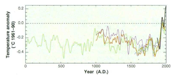
In order to avoid quoting any “climate denier”, let me go right with “consensus science”. The chart below is taken from BO99. It shows a couple of temperature reconstructions, though the main point is a bit concealed as they included the measured temperature record in black, which overlays the reconstructions. Still I think it is visible how all these reconstructions decline after 1950, despite the actual temperature record, and temperatures themselves, going up after a short dip. It is a remarkable piece of honest communication. And please bear in mind, they smoothened the data, making it look a bit different from the data garbage I presented above. Also there is more noise, meaning more random walk because there are less sample data. But otherwise, this looks amazingly familiar, and not incidentally so.

Of course Mann had the same problem. The “proxy” data showed declining temperatures after the reference period and we probably all know how he “fixed” it. He simply dumped the “proxy” data, replaced them with the actual temperature records and spliced the two series. And that is not bad science, rather it is simply not science at all. It is pure nonsense.
I should also mention there is this claim circulating he had used an “algorithm” to produce a “hockey stick” with whatsoever data, meaning he was plainly cheating. I think that is a bit unfair. His algorithm was nothing but the named selection, although technically it worked by weighting. So he gave a lot weight to a few data fitting the reference and little to no weight to those which did not. This is not a sophisticated treacherous algorithm, rather it is basically a simple selection, like I described it from the start.
The point is, and it is the one thing I want you to understand, that all the characteristics and controversies over Mann’s “hockey stick” are nothing but the logical consequence of the original sin. Let us do it step by step.
- There are non-functional “proxy” data in the sense that they do not hold the information you search for
- To at least give the impression they might work, you have to pseudo-correlate them to known data over a reference period by selection
- This selection inevitably leaves a fingerprint in the shape of an opposing trend beyond the reference period
- Naturally this trend has no correlation whatsoever with reality, which becomes a problem as far as the reference period ends early. Then there will exist further data revealing the fundamental mismatch between “proxy” and reality
- The overcome this problem you will have to truncate the “proxy” data and replace it with something else. In the context of Mann’s work it means to “hide the decline”
It is not a big conspiracy in the first place, but rather just a stupid idea that does not work. To make it work somehow nonetheless you will have to cut some corners, like integrity and consistency. If you think this is wrong, then look at it from Mann’s perspective, and that of the consensus science community. Thanks to this work Mann became famous and likely rich. It was stupid, it was wrong, it was pointless, but it paid off for him. Equally it was convenient for the community and thus a service to it.
And of course it can be reproduced. In fact I could reproduce Mann’s work, which I presented right at the beginning. Given I based my simple reproduction on junk random data tells something, but hey, people have different preferences. For some reproduction is an endorsement on its own right, and no I am not talking about sex. Rather they think if you do the same thing with the same parameters and you come to the same result, the procedure has been proven right.
Copium
Right after climategate there had to be hot fix and “skepticalscience.com” has some amazing takes on it .
Thus, the study suggests that the current divergence problem is unique over the past thousand years and is restricted to recent decades.
The divergence problem, the inconsistency between “proxy” data and temperature records, is something unique, it never happened before, trust us!
As the divergence is widespread across high northern latitudes, Briffa 1998 suggests there may be a large scale explanation, possibly related to air pollution effects. A later study by Briffa proposed that falling stratospheric ozone concentration is a possible cause of the divergence, since this observed ozone decline has been linked to an increased incidence of ultraviolet (UV-B) radiation at the ground (Briffa 2004).
Briffa logically also suggested..
Unfortunately, these trees display a progressive increase in growth from the middle of the 19th century, which may be wholly or partly due to rising atmospheric CO2 levels. How can we distinguish the growth-promoting effects of warm temperatures from the possible influence of increasing CO2 and perhaps even other anthropogenic growth enhancers such as nitrogenous pollution?
But that would not have been helpful, so they ignored it.
Various studies have noted the drop in Alaskan tree-growth coincides with warming-induced drought. By combining temperature and rainfall records, growth declines were found to be more common in the warmer, drier locations.
Sure, if it gets warmer it becomes drier and so trees grow less. Logical, isn’t it? But then, how do you equate good tree growth with warmer temperatures over a 1000 year “proxy” period?!?!
Studies in Japan and Bavaria suggest increasing sulfur dioxide emissions were responsible.
As the divergence is widespread across high northern latitudes, Briffa 1998 suggests there may be a large scale explanation, possibly related to air pollution effects. A later study by Briffa proposed that falling stratospheric ozone concentration is a possible cause of the divergence, since this observed ozone decline has been linked to an increased incidence of ultraviolet (UV-B) radiation at the ground (Briffa 2004).
Connected to this is global dimming (a drop in solar radiation reaching the ground). The average amount of sunlight reaching the ground has declined by around 4 to 6% from 1961 to 1990.
One study suggests that microsite factors are an influence on whether individual trees are vulnerable to drought stress. Eg - the slope where the tree is located, the depth to permafrost and other localised factors (Wilmking 2008). This paper amusingly refers to the divergence problem as the "divergence effect" so as "to not convey any judgement by the wording" (you wouldn't want to offend those overly sensitive Alaskan trees).
Throw as much as you can on the problem and hope that something sticks. The main divergence problem was actually occurring with Alaskan trees where pollution never was really a thing. Anyway, that much “copium” shall only demonstrate the resilience of climate alarmists towards falsification. Pretty funny!
The “hockey stick” problem is something I can not take credit for, rather that belongs to Ross McKitrick and Stephen McIntyre. It is one of the very few examples where “climate science” was legitimately falsified. Not the whole of “climate science” of course, but just a part of it, because that is how it works. You take a certain claim, put it to the test, and possibly you could falsify it.
You will not falsify a whole discipline, like “climate science”, though that apparently is what a lot of “climate deniers” believe they could do by bringing some Flat Earth nonsense. It will take an awful lot more to achieve far less. But there is an upside to it: then it is real, not just phantasy. Since it is something real, I reproduced the whole story here and summarized it to its core.
The significance of such a falsification can not be measured by quotations, because that would be a taboo in paper-published “climate science”. Rather it is all objections, usually using straw-man arguments there. Realclimate.com has a search function, the term “hockey stick” delivers no less than 250 results just there. That is an awful lot of copium!
And while I certainly will not seek to diminish the accomplishment by McKritrick/McIntyre, since it is one of the few positive exceptions, the question is rather why there is not more of it. Just to put things into perspective, while this a single instance, I have published around a dozen true falsifications here alone. I know what a monstrous achievement it is.


Comments (0)
No comments found!