
Deception with emission spectra part 1
Emission spectra as seen from satellites, or modelled with modtran, are probably among the most profound evidence for Earth's greenhouse effect. They visualize not just how greenhouse gases reduce emissions, but also which GHGs do that and to what extent. However, these data are highly deceptive as they get matched against the erroneous benchmark of a perfectly emitting surface. And it seems everyone falls for the trick.
Let us look at one typical example, apparently published by Gavin Schmidt with NASA1

Another way of quantifying the effect is to look at the difference between the infrared radiation emitted at the surface of the Earth, and the amount that is emitted to space at the top of the atmosphere. In the absence of the greenhouse effect, this would be zero (in other words, no difference). In actuality the surface emits about 150 Watts per square meter (W/m2) more than goes out to space
Ts of course stands for temperature of the surface and quite obviously it is being suggested, the surface would emit like a perfect blackbody, or almost at least. Indeed within the atmospheric window in the 8-13µm range (or wavenumber 770 to 1250), where the atmosphere is highly transparent for LWIR, the blue area clings on to the red line, with only a tiny deviation. Beyond the atmospheric window we can not "see" the surface, or it's emissions respectively. However the "red line" is indicating what the emissions would be like if there were no GHGs. Accordingly the graph shows very well how much the respective GHGs impair emissions.
The graph gives us an intuitive understanding of what the GHE actually is. It is all about the emission altitude. The more opaque, the more abundant a GHG is, the higher up in the atmosphere it will become transparent enough to finally emit LWIR to space. There are even two notable exceptions which only confirm the rule, so to say. In the centers of both the CO2 and the O3 emission bands there are thin, but long spikes. At these wavelengths the respective GHGs are so opaque, that their emission level is high up in the stratosphere, where temperatures increase with altitude. In these cases the effect of GHGs is partially reversed.
Just in case you wonder, the blue part makes up for about 70% of the area under the red curve. This percentage is pretty consistent with the general assessment of the size of the GHE, although the chart represents a specific scenario. If we assumed 390W/m2 of surface emissions, then 70% of which will be 273W/m2, which is about the emissions we have with clear skies (~270W/m2). Note: it is not 240W/m2 and that is because clouds reduce emissions by another 30W/m2. For some reasons these charts always show clear sky scenarios.
So far everything is good. There may be people however, and I have read some according posts, who doubt these data. It is understandable that if you deny the GHE per se, you might also reject such compelling evidence. The arguments brought forward, both why the GHE would not exist and/or why the emission spectrum was wrong tend to be pretty dull and are easy to dismiss. These measurements have been made by a lot of researchers all over the planet with very consistent results. There is really no reason to doubt them.
The real problem here is the red curve! It is the assessment of surface emissions which seems to be confirmed by the measured emissions within the atmospheric window. I know, it seems perfectly reasonable to assume the part we do not see (or measure respectively) might resemble the part we do see. But as logical as the assumption might seem, it remains an assumption, which is always prone to failure. Regrettably that is exactly the case here. To complicate matters even further, there are two fundamental mistakes, depending on whether the surface is land or water. Since water is the dominant surface type, let us deal with it first.
If we go back to our "water emissivity landscape" the problem is easy to identify. A satellite's view onto the surface is limited in two ways. It sees through the atmospheric window and it looks more or less straight down. I marked this segment of the landscape with a red elipse. I do not really know how far a specific sensor would look sideways, but it is not about the technology here. The path through the atmosphere is simply becoming longer the more you look to the side and that will necessarily impair vision.
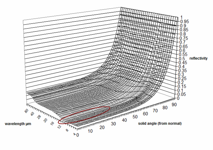
Incidentally reflectivity within this segment is very low and emissivity is accordingly high. It does not quite resemble a perfect blackbody, but it comes fairly close with emissivity in the 0.99 to 0.98 ranges and about 0.97 towards 13µm. You can look up these data in the "modis emissivity library"2. Not that I would be of much use anyhow. There the satellite measured data look like this..
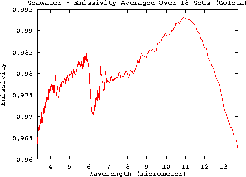
These data are in basic accordance with the 3D graph above, but it is just a tiny fraction of it and in no way they represent the bigger picture. Yet that is exactly the claim. These minimalistic satellite data would represent the whole emissivity landscape and the deviation from 1 was so small, that it could be ignored anyhow. This idiotic reasoning is the basis for the red curve in Gavin Schmidt's emission spectrum. When he claims the surface would emit 150W/m2 more than actually go out into space, which is 240W/m2, then he means the surface emits 390W/m2, which is only true for a perfect emitter at 288K.
Now that we know emissivity is only 0.91, we also know the red curve is set far too high. I needs to be moved downward by 9% on average to match actual surface emissions. Within the atmospheric window it will fall below the blue curve, as actual emissions (hemispheric) there are lower than measured emissions (to surface normal). But most of all, the difference between the two curves in terms of radiation emitted will be only in the 85W/m2 range.
Funny as it is no one ever seemed to realize the problem and how selective perception (by satellites!?) has been exploited, intentionally or not, to misrepresent the physics. I perfectly understand it. People do not want to look stupid by "disbelieving" satellite data, while on the other side they are not smart enough to put them into context.
Comments (0)
No comments found!